


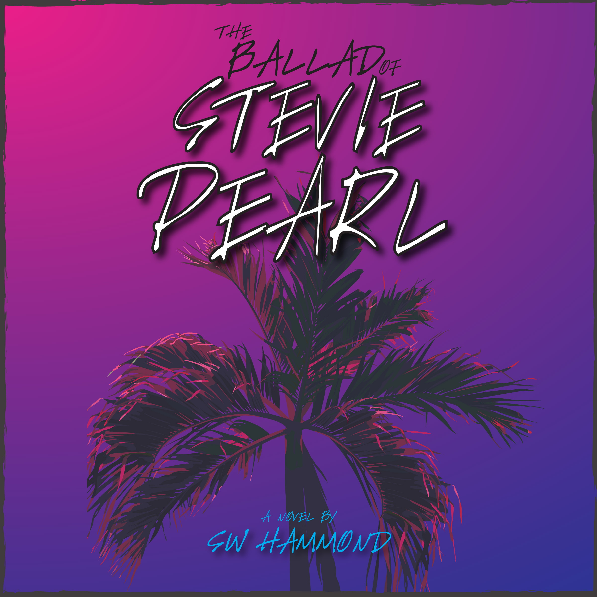
The official hardcover, paperback, digital, and audiobook covers of SW Hammond’s newest novel.
It took quite a while to arrive at the final version of Stevie Pearl’s book cover, but I’m finally happy to share it with you! What do you think?? I like it. I’m liking it more and more the longer I look at it. No matter what your momma taught you – books are judged by their cover. Does this look like something you’d want to read?
From the very start, I knew what I wanted for Stevie Pearl. I wanted a modern spaghetti western movie poster. I wanted Alex standing in the middle of street like a gunslinger, the Hollywood sign hovering above him on the mountain in the distance. He’d be guiding Stevie behind him with his left hand, using his body as meat shield to protect her from the gunfight that was surely about to ensue. Art galleries would line the vacant Santa Monica street and his Jeep would be parked off to the side. The whole thing would have been a modern take on The Good, The Bad, and The Ugly movie poster – the same coloring and feel, but with The Venture Bros. style animation.
As you can see, that clearly didn’t happen. I knew creating anything of that magnitude would be quite the undertaking. Basically, it came down to overall budget for this book and availability – I don’t have much money, and the artist I approached didn’t have much availability. In short, the timing wasn’t right for her and the longer I thought about it, the more I relented to the logical conclusion of re-allocating book cover funds to other aspects of the release that I can’t take care of on my own.
I’m fortunate. Due to the day job, I have the software and ability to create my own designs and covers. I designed all of my previous book covers – along with almost all of the other graphics, videos, and content you find on this site – and while it may not have been what I “wanted”, ultimately, designing a cover for Stevie Pearl on my own was the most viable option. However, it turned out to be a really slow and challenging process.
At first, I attempted to create the spaghetti western vision. Wow – that was awful. I was quickly reminded how little (zer0) drawing ability I have. I then tried manipulating stock vectors and other licensed images to collage-together some sort of Hollywood-meets-wild-west-Clint-Eastwood cover. Yeah, that also didn’t work out well… so bad. It was a bummer. I wasted many, many hours and eventually gave up on the entire thing for a while.
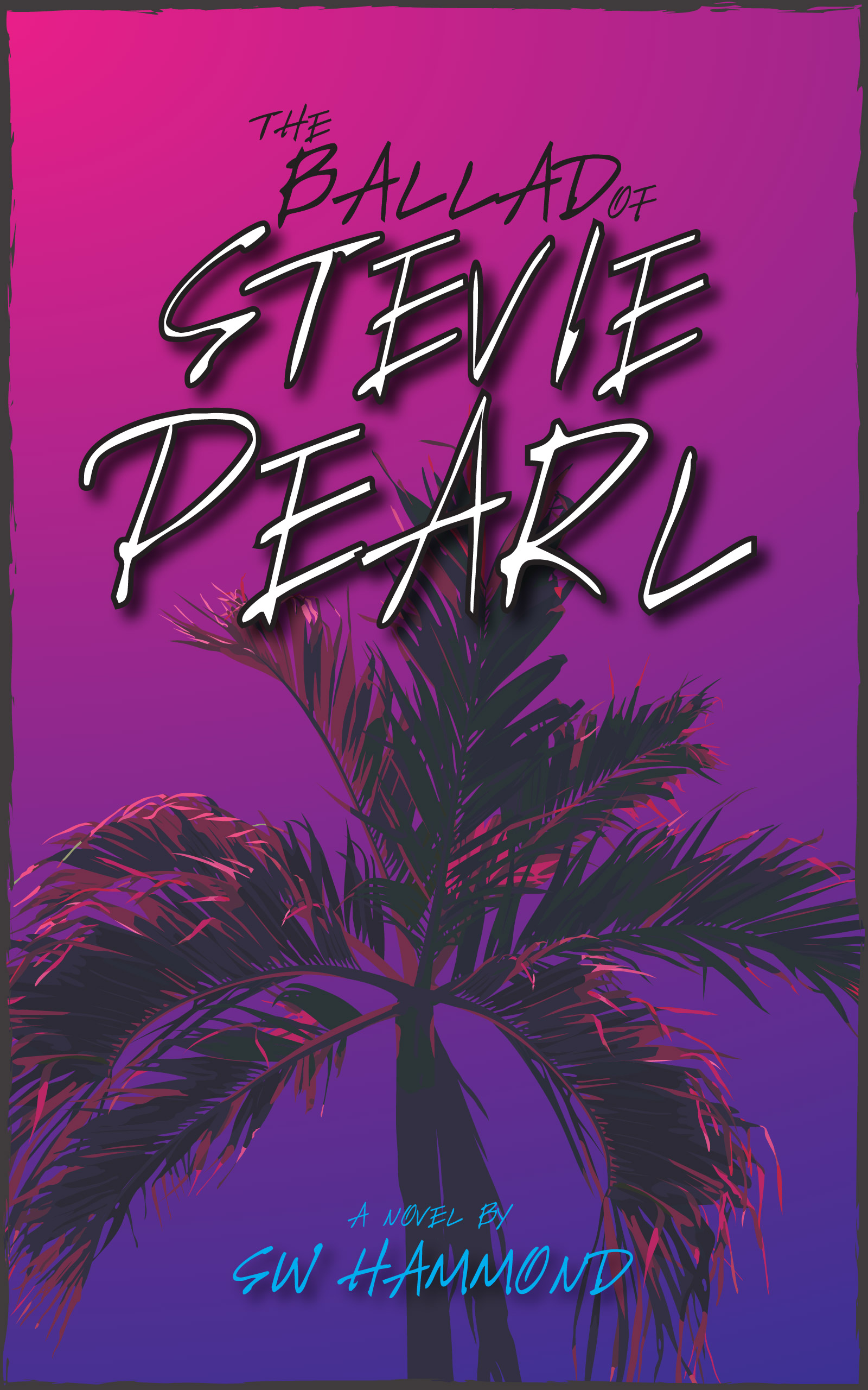
Next, I attempted the “hoodie cover”. This one drove me nuts because the concept was simple, but I couldn’t get it quite right. This is where I solidified the sickeningly-sugary-sweet-bubble-gum-pop pink and purple color scheme, but I wanted to contrast that with a powerful illustration of Stevie. I imagined her head tilted down, her face hidden deep within the shadows of a zip-up hoodie. Her long blonde hung from the hood and curled down her chest – her finger wrapped around the drawstring. Almost a silhouette – just the frame of a woman, hoodie, blonde hair, and a finger wrapped around the string. This one of my favorite scenes in the book and a pivotal moment between Alex and Stevie. Again, I lacked the drawing ability to do this well. I would have had to hire another illustrator or do a photo shoot with the proper model playing the role of Stevie. Between ‘rona and pragmatism, it just wasn’t going to happen. I again abandoned the idea and relented to something I could control – something I could create on my own.
Finally, I accepted that less is more – especially if I couldn’t create any of my visions. Once I began developing the hoodie idea, the final layout and colors have remained the same. I liked blending the bubble-gum-pop – the surface of the story – with a dark silhouette. It’s all about mixing signals, alluding that things may not be as they seem. So, I simply swapped my botched hoodie for palm trees.
The trees were an adequate fallback. They give the impression of paradise and lavish lifestyles – a sense of pristine idealism. I went through several variations before sticking with the single tree silhouette. Again, the black silhouette combined with the pink tips of the fronds adds a striking contrast which encapsulates the messaging throughout the entirety of the book.
The title font is also doing a similar job – it’s giving the cover teeth. The handwritten text is powerful, almost sinister, adding another unexpected contrast. Instead of going with a bendy and bubbly font to suit the pink and purple gradient, this title almost looks like a serial killer’s note. That’s what this cover is – and that’s what this book is – a multitude of contrasting and competing sensibilities combing to create something beautiful. And, after all my struggles, I do think the cover is beautiful. I really do enjoy looking at it.
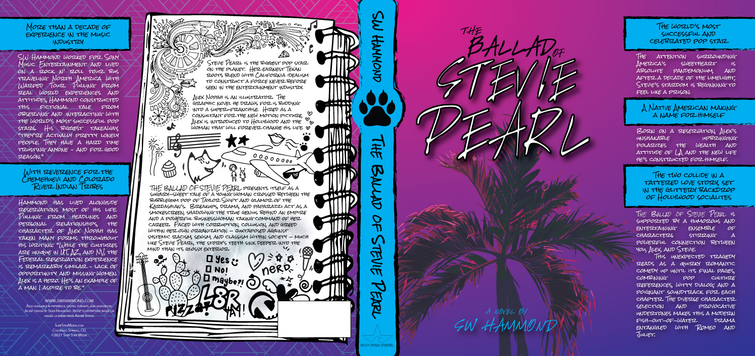
I knew early on that I wanted to utilize a notebook concept for the rear cover and synopsis – that’s about the only thing that went as planned. I imagined someone finding Stevie’s private note pad – the place where she writes lyrics and works on songs. I imagined she’d be consumed with Alex, lots of daydreaming with scribbles and doodles – the same way we used to ignored the world and draw in class. What appears to be a mindless infatuation are actually scribbles of memories referencing Stevie’s favorite moments with Alex from the book. It all means something, and I like that. If you look closely on the hardcover version, you’ll also see water stains from tear drops… Again, it’s all about contrasting while hinting toward the unimaginable pain she’s been through.
Finally, I like that I was able to find a place for Gibby, Stevie’s dog. His paw print on the spine of the hardcover and paperback versions is one of my favorite parts of the cover. In my daily life, I see the spines of my books more than I see the actual covers. I know, even years from now, this little paw print will get me every time I see it.
Anyway, there may be some minor tweaks between now and the official release (bar codes, etc.), but I wanted to share this with you. I like it, I think it’s going to serve the book well – but I also know that it doesn’t have to be forever. The fantastic thing about owning all of my rights is that I can change covers whenever I want. Maybe, somewhere down the road, I’ll hire someone to create one of the covers mentioned above for a revision or special edition? Until then, I hope this cover encourages you to give the book a shot. As eye-rolly as this poppy plot seems, I love these characters and think about them all the time. I think you’ll enjoy them as well.


