Today’s the big day—the long awaited cover reveal for The Final Book: Gods!
It’s been fun, lots of posts on social networking. Big thanks to Juniper Grove Book Solutions that coordinated a bit of publicity—I was getting tweets all day! I took the book on a road trip across the Southwest and stopped at a bunch of unique spots for a picture–kind of like my version of the traveling gnome. It’s been neat. Kind of different and more fun than just tossing up the graphic.
I’ve been sitting on the cover for more than a year—I knew what I wanted and how it was going to look a long time ago. However, it’s been fun seeing the response. There were probably only 3 or 4 people who had seen the cover prior to today, so I wasn’t sure of what kind of reaction it would get. So far, people seem to really it—the biggest surprise being on the back of the book and that I incorporated Cloe’s letters. Everyone who has read the book absolutely loved that element—they really got excited when they saw her words to Josh, haha. The letters also seemed to generate a lot of interest and intrigue from those who haven’t read the book, so hopefully it hooks them too.
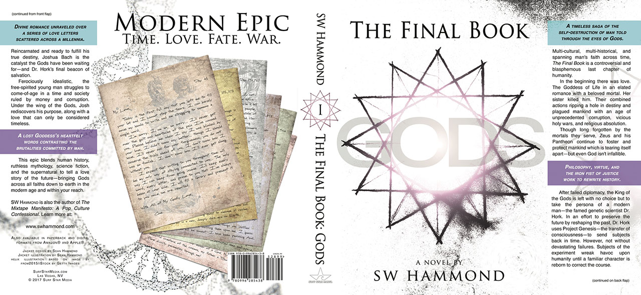
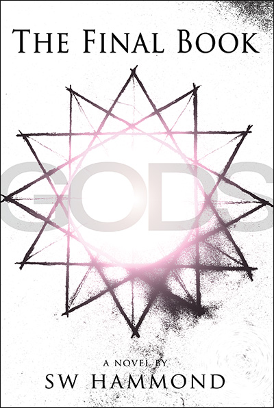
The 12-pointed star on the front is simple, but entrenched with symbolism (just like the entire book); each point representing a pillar of Olympus and Zeus’s Pantheon. The meaning behind the star is quite important to the Gods and shows up several times throughout the book. The magenta glowing ball of light shining through the star is the only part of the front cover that is in color—but works well and really makes things “pop.” The artwork contrasts in such a way that the center of the star actually seems blindingly bright—like you’re staring into the sun and can only look at it for a second. I really like how it came out—it’s a “logo” that can certainly carry the weight of the entire series.
The “dust” around the edges and the swirls in the lower right aren’t just for show—it all ties very closely with key elements and characters. That will make sense when you get into the book, but for the casual observer it adds a feelings of grit and grunge—a bit of dirt to suggest that the Gods aren’t as pristine as one may think—which Dr. Hork would be the first to admit.
It was a bit of a process to create the design. Starting out, I knew I wanted something celestial and I wanted something twelve. Twelve was important. But I also wanted simplicity. I wanted to strip everything away, which is what this book is all about—the foundation of who and what we are. I saw a computer graphic, like screen saver, of a twelve pointed star and I immediately knew that was it—that was the structure that perfectly encapsulates my story.
I hand-drew the graphic you see on the cover. I carefully marked out all of the points with a ruler, but then free-handed the lines that connect between. I wanted that rough and overlapping look at the points, suggesting the lines could go on forever. Once I had it all drawn out, I waited for a pristine sunny day (not hard to find in Vegas) and I mounted the drawing on a clear clipboard. I clamped the clipboard to a mic stand and positioned the drawing up into the sky so that the sun perfectly filled the center of the star. From there, I put the camera on a tripod and took a photo.
I then brought the image into Photoshop and started messing around. The dust and dirt all happened organically just by messing with the exposure and contrast. I then added a filter to get the magenta ring, threw the text on, and added a lens flare over “GODS” to make look like the light was shinning through the letters.
The whole process was probably more “elaborate” or time-consuming than it needed to be—however, I happy with it. It’s unique. It’s mine. I hope it gives the book that extra bit of genuine authenticity that helps it walk a tightrope between being a quality professional product but still containing every bit of soul and danger not found on most bookshelves.