


A book that I was 100% confident in publishing, just sat on the shelf. Never released.
I had the unique opportunity (forced?) to step away from a completely finished Stevie Pearl for almost 2 years prior to releasing it. So, when I picked it back up, it was a little like reading it all over again for the first time. I wasn’t anticipating what I wrote – enough time had passed where I was actually reading what I wrote. That lead to another revision. In reality, the published First Edition is practically what would have been its Second Edition. You’re better for it. There’s always room for improvement.
With that said, I was never in love with the cover. There were two designs that I wanted desperately, but don’t posses the talent to create. First, I wanted a The Good, The Bad, & The Ugly movie poster. I wanted to create that 70s illustration-look, with bold reds and yellows. Alex would be standing in the middle of a Santa Monica street like a gunfighter, facing you directly. The Hollywood Hills and sign would be in the background. With one arm, Alex would be guiding Stevie behind his back, shielding her — with the other he was reaching for his gun.
Second, I wanted a woman’s silhouette. She’d be facing you directly, her blonde hair flowing but her face buried deep in the shadow of a purple hoodie. Midway down her chest, the white drawstring of the hoodie would be wrapped around her finger. The cover would be white, she’d be wearing a purple hoodie, and blacked-out shadows with her face lowered so you’re unable to make out a distinct figure. Then the title big and bold, just below the wrapped finger.
The first cover didn’t happen because I can’t draw. At all. I tried finding some stock images and blending them together to mimic what I’m describing above, but they all came out so bad. The second didn’t happen because I couldn’t perfectly match what was in my mind. There’s lots of stock photography of purple hoodies, but none with Stevie Pearl standing in them. I thought maybe I could take the photo myself, but again, I don’t know Stevie (in real life...). Believe it or not, I don’t have pop stars on speed dial anymore that could have acted as an adequate stand-in.
So I tinkered around with some palm trees and I created something that didn’t offend me. This is the cover that editors and early readers received. I didn’t love it — it fell way short of what I wanted, and at that point anything other than the two ideas described above would have felt disappointing. It worked, and the pink looked pretty sharp on a hardcover. It popped in real life — and was a departure from the white background of my other books. I didn’t set out to have a theme across my covers — I swear, that was not planned — but, whites, purples, pinks, cyans all look good to my eye. It’s just really appealing to me, and I couldn’t explain why.
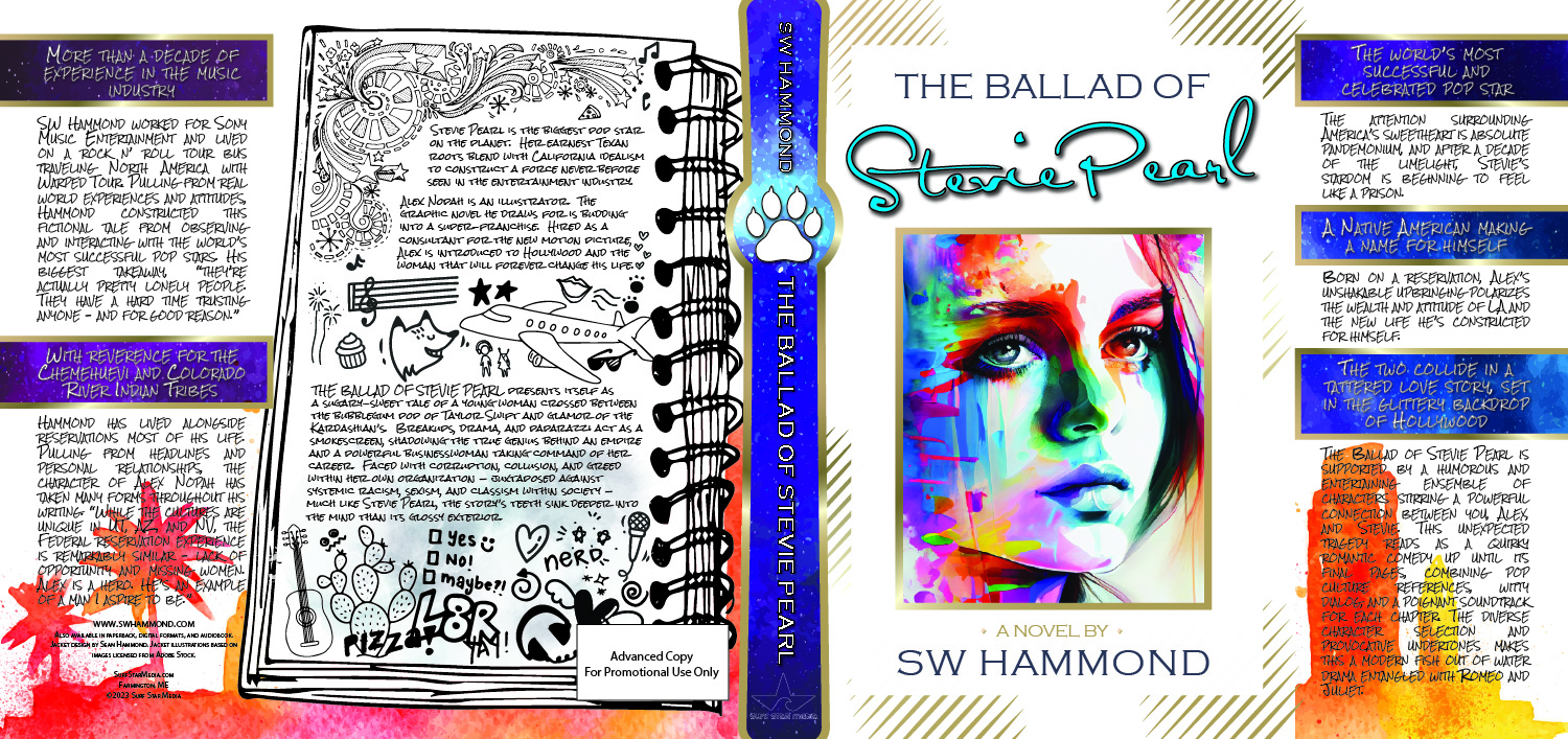
Now, here we are. After being away from the cover, I could re-approach with no expectations except knowing that I couldn’t create exactly what I wanted. This gave the second chance an unbound freedom. It was never going to be perfect, so it didn't try to be. It wasn't chasing after an idea, it was just being the best version of itself. And then there's the painted illustration – it's something that been haunting me. I was doing work for another project when I came across the vibrant portrait on Adobe Stock. I just loved it. I had no use for it at the time, but I licensed it anyway. Again, something about white with the bright colors.
At this point I knew that I wanted a clean cover. Something tasteful, simple, elegant. So, I started browsing wedding invitations. The gold seemed to resonate but in my mind the cover was white — it had to be white. That derailed me for a moment. Again, I wasn't trying to match the other covers, or purposefully adhere to a particular style... But then, I thought, maybe this is my style? Just like Lorde's black cherry lipstick, white and purple is my jam? It just feels right. So, now I have the title at the top, my name on the bottom, and gold outlines and dashes. The moment I connected that the center gold square looked like a picture frame, a revelation struck about a particular haunting painted image. I tried it. I dropped the portrait in place, and there was Stevie Pearl.
Let me know what you think about the new cover. How does it compare to pink palm tree? What would you have designed if I hired you to create the cover?
P.S. — Does the title font look familiar?? More homage to Taylor Swift. I thought that was a quirky easter egg, not sure anyone will notice.


